Back to Projects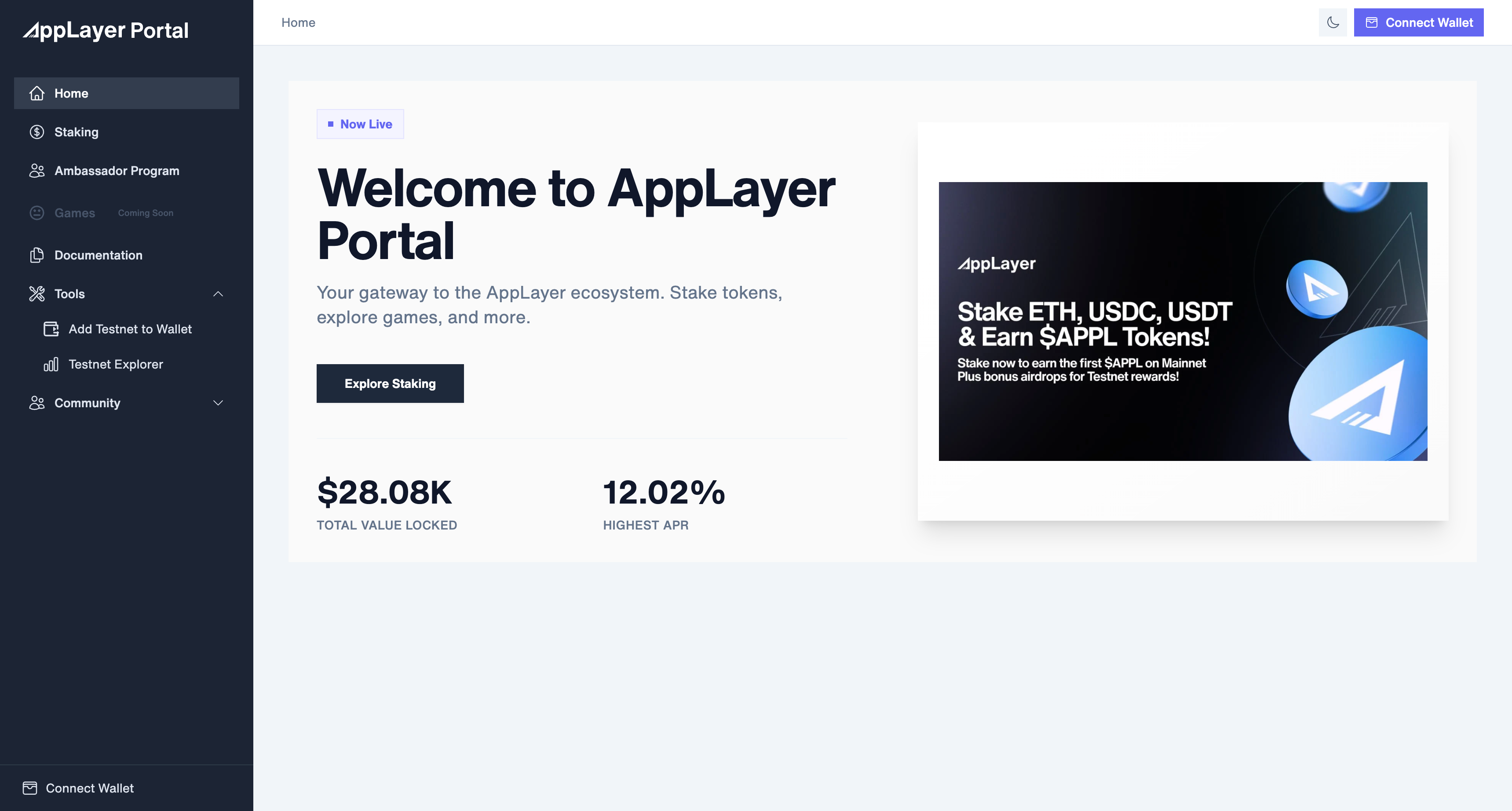
UX/UI Design of the AppLayer Portal
- Client
- AppLayer Labs
- Role
- Full Stack Developer & UX/UI Designer
- Date
- 2025
- Tools
- React, Tailwind, Web3, Figma, AWS
- Platform
- Web Dashboard (Desktop-first)
📌 Overview
AppLayer is an EVM-compatible blockchain project focused on democratizing access to Web3 tools. I led the UX/UI design and frontend development of the AppLayer Portal, a unified platform for staking, ambassador tracking, and community tools.
💡 Problem
Web3 dashboards often feel fragmented or overly technical. AppLayer needed a clean, intuitive interface where users could:
- Stake tokens across different vaults with real-time APR insights
- Monitor their wallet activity and rewards
- Refer others via the Ambassador Program
- Explore community tools and future features (like games)
🧱 UX Goals
- Provide a cohesive user flow across staking, referrals, and dashboards
- Ensure users without wallets still understand the platform
- Make financial metrics (APR, TVL, Rewards) easy to scan and trust
- Build a scalable design system for future tools
🧱 Key Features & Screens
1. Home Page (“Welcome to AppLayer”)
- Shows total TVL and highest APR
- Guides users toward staking
- Responsive wallet connection prompt
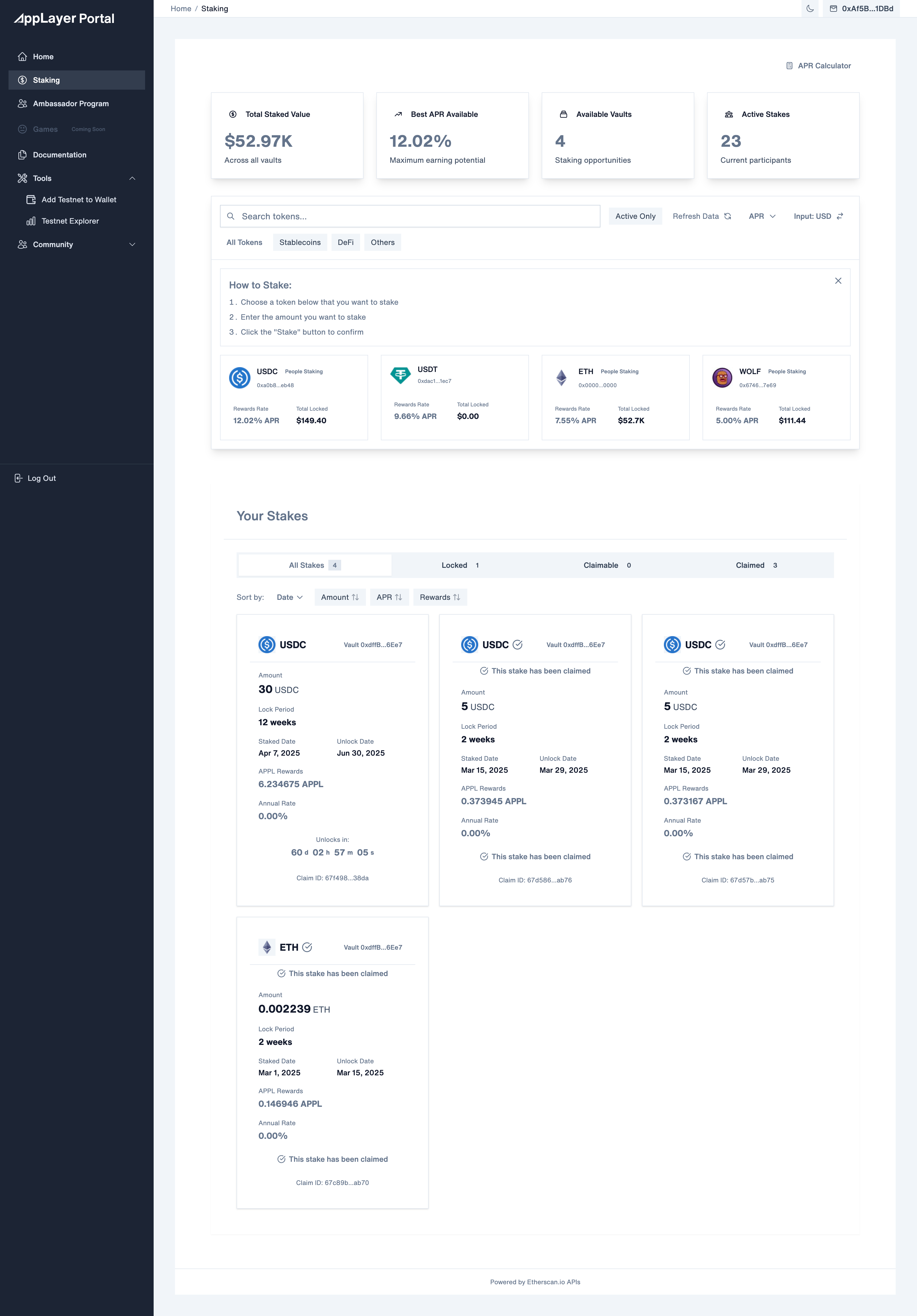
2. Staking Page
- Sortable token vaults by APR or type (Stablecoins, DeFi, etc.)
- Interactive cards with staking terms, locked value, and real-time rewards
- Calculator for APPL token estimates
- Support for locked/claimed stakes
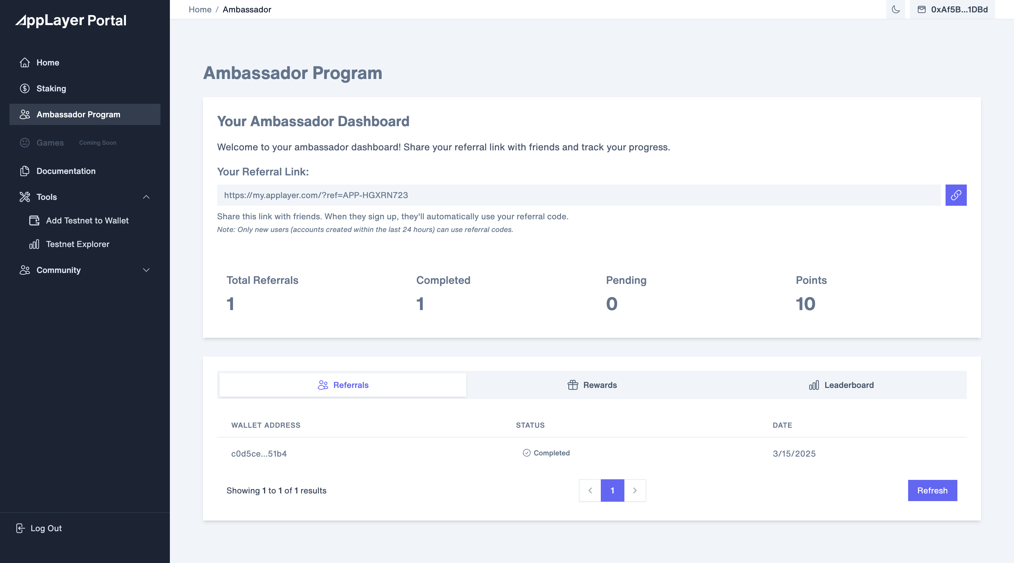
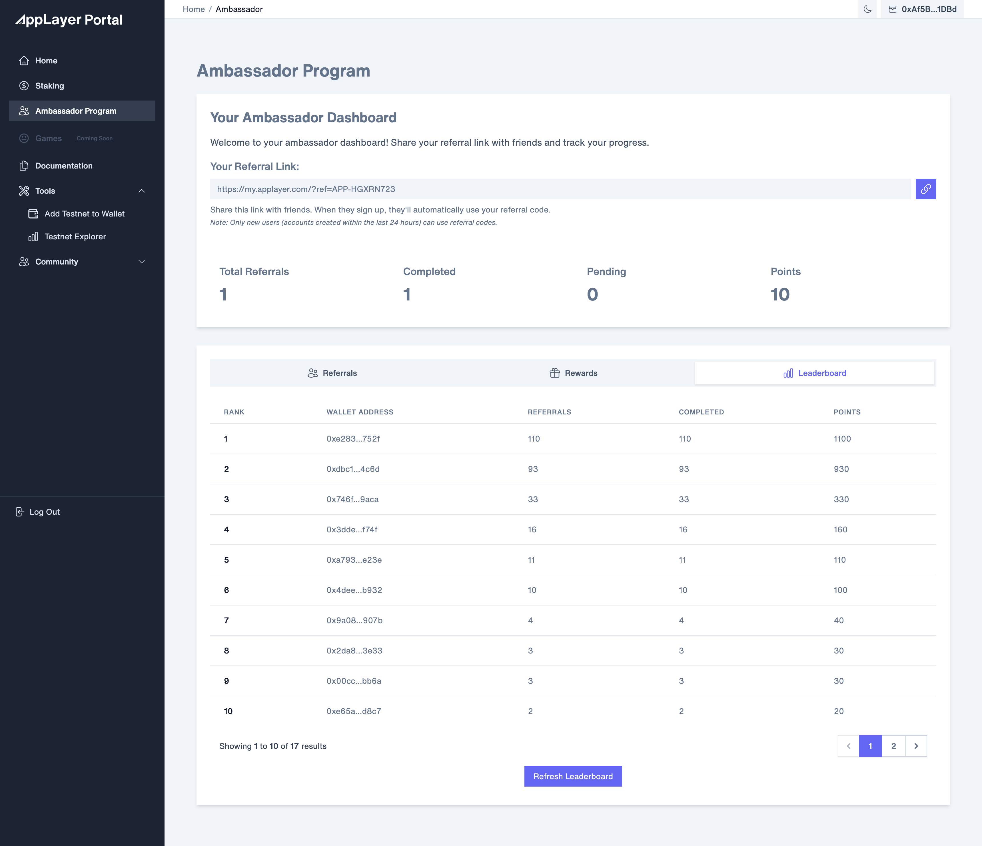
3. Ambassador Program
- Referral link generator (auto-copy)
- Stats: Total, Completed, Pending referrals & earned points
- Leaderboard with rank, address, and referral stats
- Tabs to switch between Referrals, Rewards, and Leaderboard
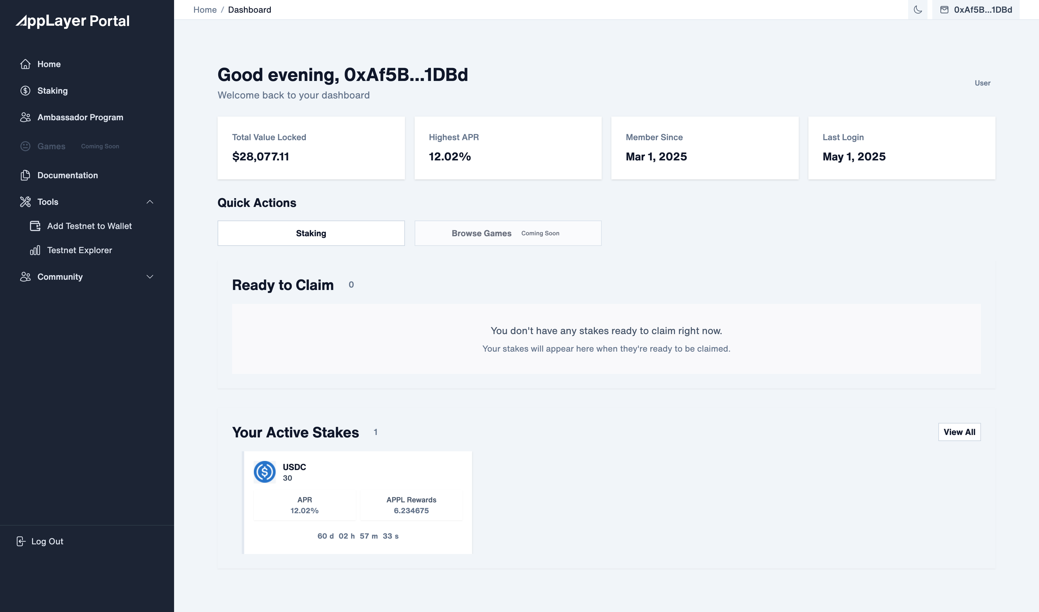
4. User Dashboard
- Overview: total value locked, highest APR, member since, last login
- Quick Actions: stake, view games (coming soon)
- Active Staking status and countdown timers for unlocks
🔍 Design Decisions
- Sidebar Navigation: Persistent left nav with icons for quick discovery
- Modular Layout: Tabbed interfaces for context switching (e.g., referrals vs. leaderboard)
- Wallet-Aware States: View-only mode for disconnected users, prompting connection when needed
- Clear Rewards UX: Visual hierarchy and separation between APR, earned tokens, and unlock timers
📊 Results (Early Feedback)
- 100+ users staked within the first week
- 60% of new users joined via Ambassador links
- Near-zero support tickets due to intuitive layout
🤔 Lessons Learned
- Web3 users want both clarity and control: showing APR is not enough — users want to calculate, compare, and act
- Mobile-responsiveness increased engagement from ambassadors promoting on mobile devices
- A clean UI without jargon significantly increases referral conversion
🚀 Next Steps
- Add analytics layer for user behavior tracking
- Release NFT badge system for top referrers
- Expand staking options with partner tokens
- Roll out mobile version for Ambassador dashboard